One of the things that we were talking about in the community chat was the idea that maybe to get into the Block editor, maybe people need to get some recommendations for a good Block theme.
One of the things I do when I think about what themes to review, is I think about what companies have a financial stake in making sure that WordPress is easy to use, and that end users who are not experts are successful.
That leads me to look at three places: The most used themes on WordPress.org, the recommended themes on WordPress.com created by Automattic, and the themes created and maintained with GoDaddy.
I take the most popular themes on WordPress.org, but I take that with a grain of salt. 45% of WordPress sites are running a version of PHP less than 7.3 according to Statistics | WordPress.org. Just because its popular, doesn’t mean its a great idea, and the community might be lagging behind trends.
Even so, there are themes I recommend with that list:
-
Astra is still one of my go-tos. It’s a very minimal theme, and I like the header and footer builders. It lets me do full site editing type things, without being a full site editing theme.
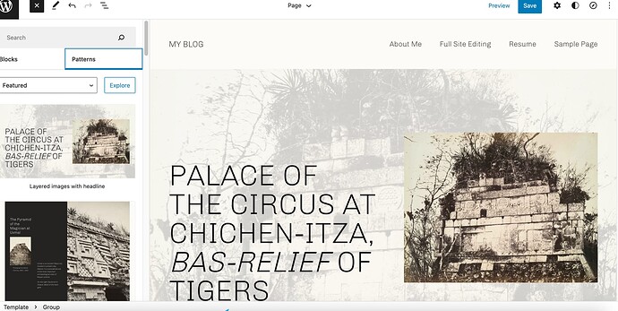
- I’m really liking working with theme Twenty Twenty Two. Since I have full control over the header, footer, blog roll, typography, and colors, it checks a lot of my boxes.
- I used to recommend OceanWP, and that’s there. But honestly, it is just starting to feel overcomplicated compared to these modern themes.
-
Go has been on my list of favorite themes for a while. If there is one theme to recommend to a newbie, I like that, because it has just a couple settings that make it a very versatile theme, both in display, fonts, and colors.
Automattic / WordPress.com
I figure, WordPress.com has a financial stake that their most prominent and recommended themes look great, and also have a low learning curve. I try to notice the trends that are happening there with their recommended themes. One person mentioned in the forum that part of their frustration with the block editor is that it blurs the lines between what the theme does and what can be done in the editor.
- Is that why “Blank Canvas” is among the top themes on WordPress.com right now? A theme where there is literally no header, no sidebar, no footer, and you add everything from scratch?
- I also played with Archeo recently. It’s a little illuminating to see what makes a good block theme, because so much of the structure of the past isn’t there. Instead, a great block theme should have a series of sensible and reusable templates that look great.
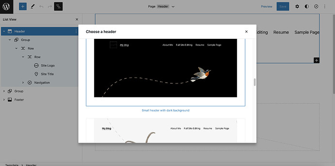
A special note about Full Site Editing Themes. Making great looking headers using the block library is actually quite hard. So one of the features of FSE is that you can “replace” a header or footer with templates that your theme designer has created. This feature was only added last minute, so Twenty Twenty Two has it, but I don’t see other themes offer the functionality. It’s just a reminder that I see so much potential in FSE, but it is truly only a beta.
–
From GoDaddy themes, I might pick out two more. The ones that appeal to me right now are:
-
Keynote, which looks to me like the visual successor of the Go theme, and
-
Barista which just seems to have a nice appealing group of colors, good headers, and as all the themes on this list, just seem to get out of the designers way.
–
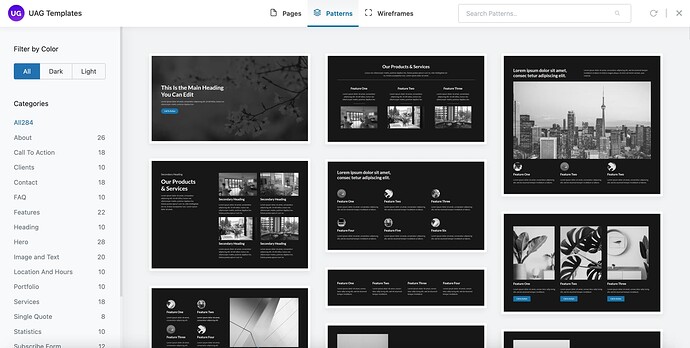
The plugin that I recommend everyone download is called “Ultimate Add-ons for Gutenberg” because it has a couple hundred block patterns that can be used in every theme.
What I love about this, is even though the ability to add these patterns is enabled by a plugin, all of these patterns are only made up of standard blocks in different arrangements. If I migrate away from using this block, none of my past work needs to be redone, unlike when I migrated away from Elementor and had to redo every page.
I hope that the Block Pattern Directory eventually replaces this plugin, with new and fresh patterns constantly being added in there.
–
Anyway, a few people on the call said they liked my “5 tips for starting with WordPress” Post, and I immediately responded that it was dated. At the time (2019), I was responding to the new block editor, and this is how I would rewrite it to respond to the beginning of FSE.
I was also thinking about my comments (and criticism) about a crowdfunded list of recommended plugins, because we might only recommend “things that we had always done” vs “the current trends of the system.” So I thought I might share how I try to stay up to date in the theme world, so that my recommendations are relatively new and fresh.


